Project Overview
Curtis Consulting partnered with American Meetings to design a coordinated banner system for Nestlé, spanning web-application screens and large-format environmental graphics used at a live event.
The Challenge
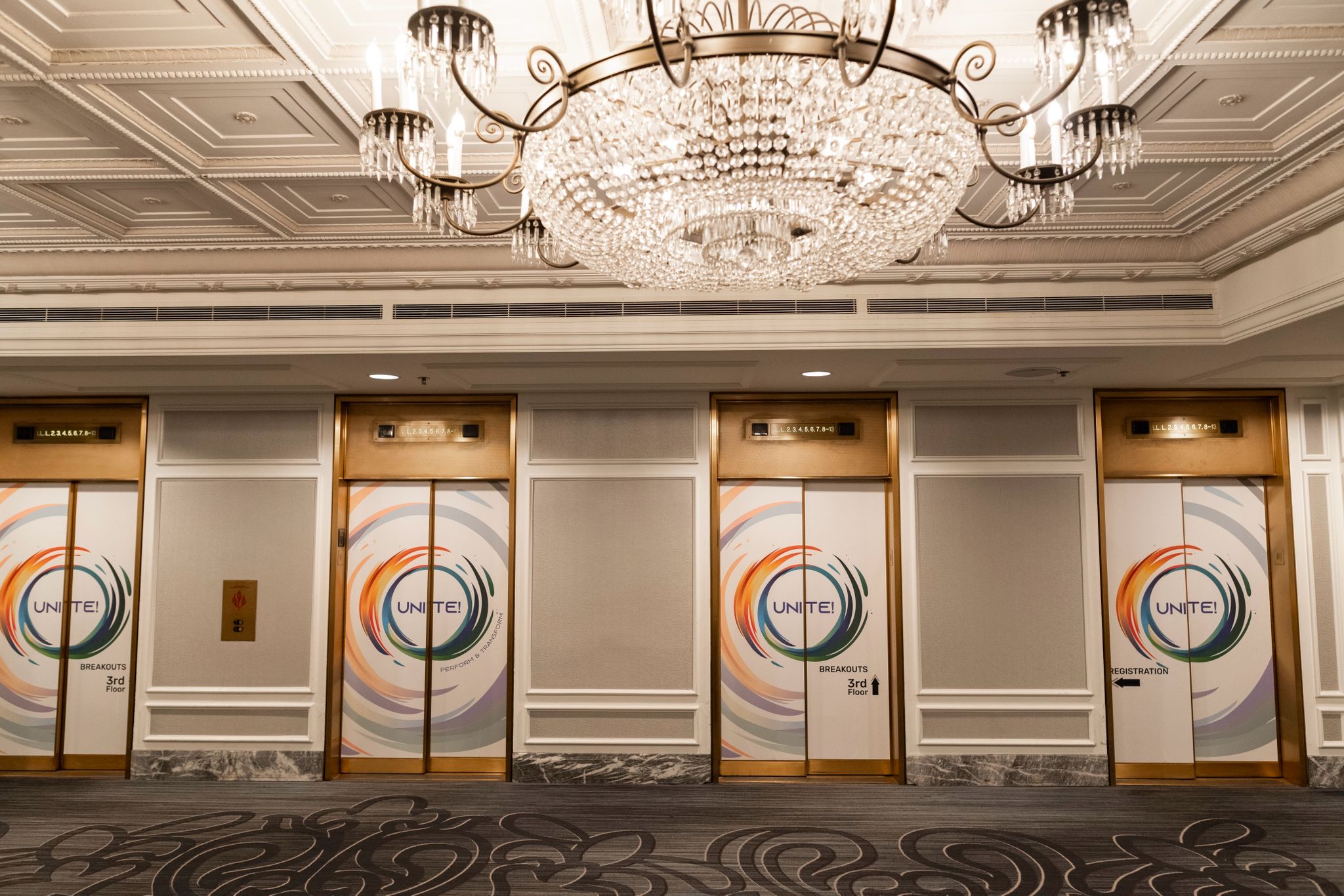
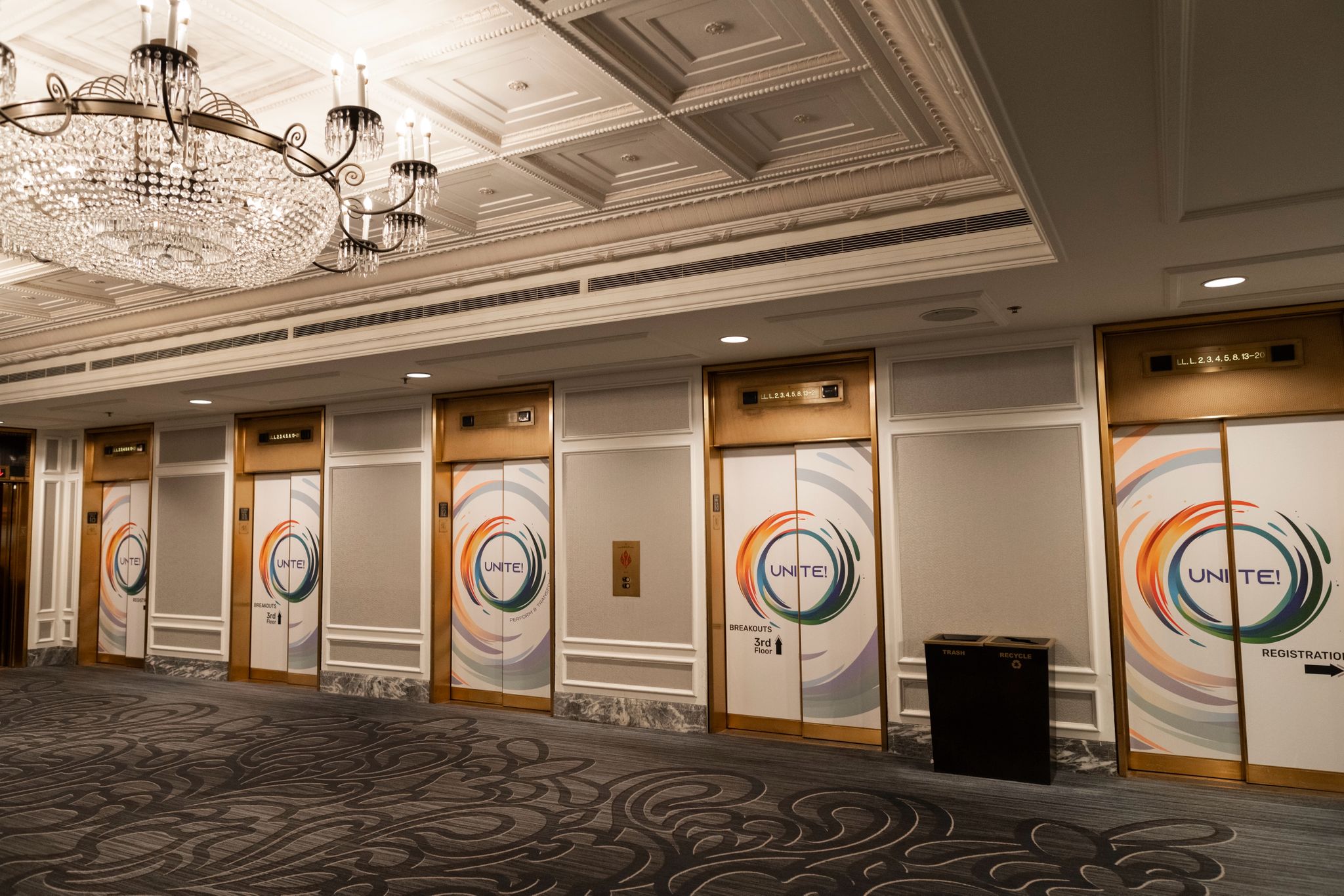
Create a unified visual system that performs equally well in a web app (pixel-precise UI banners) and in high-visibility physical environments (elevator-door banners), all while meeting strict dimension and safe-margin constraints.
Our Approach
We treated the work as a single campaign system—defining a reusable layout grid, typography hierarchy, and visual rules that scaled across formats—then produced a coordinated set of banners optimized for clarity, contrast, and brand consistency.
Key Transformations
- Standardized a banner layout framework that keeps messaging consistent across screens and print surfaces.
- Engineered designs to exact platform specifications (safe areas, aspect ratios, and supported file types).
- Created page-specific banner variants while preserving a single “event look” across the experience.
- Prepared print-ready large-format files designed to hold up at full scale without artifacting or softness.
The Solution
A complete banner suite including:
- Splash Screen: 1600 × 2560 px with defined safety margins (290 px sides, 50 px top).
- Main Banner (“Unite”): 1464 × 420 px.
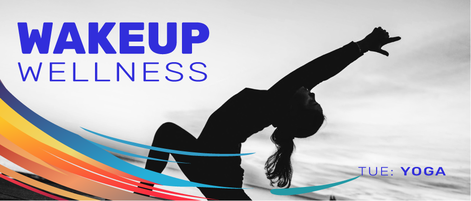
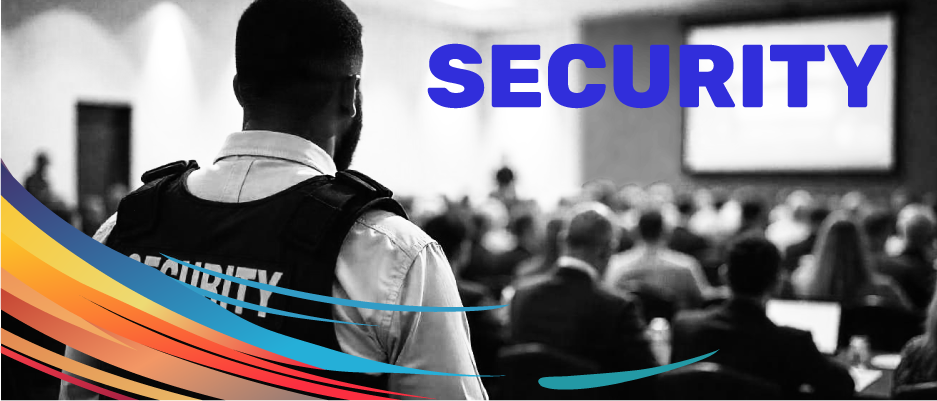
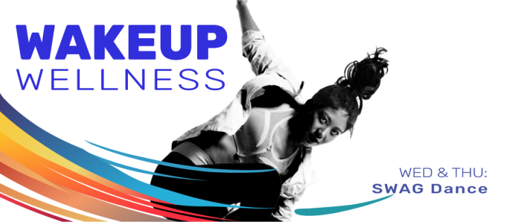
- Custom Page Banners: 936 × 400 px across key pages (Security Information, VIP Tour, and multiple Healthworks pages).
All assets were delivered in supported formats (JPEG/JPG/PNG/GIF) and optimized for crisp rendering and consistent brand impact.
Conclusion
Nestlé received a cohesive, scalable campaign visual system that translated cleanly from digital UI banners to high-impact event graphics—creating a more unified attendee experience and a stronger brand presence across every touchpoint.